Some exploration of possible logos for the Cloud Reader project. I think the silhouette of the cloud is a bit literal, but most responses from the class were supportive of it.
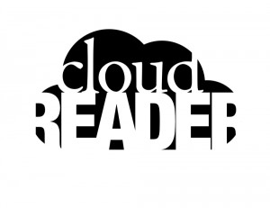
The first version of the logo. Many people indicated that it reads as “cloud beader”.
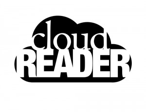 Revision of the first logo to enhance the readability of the word “reader”.
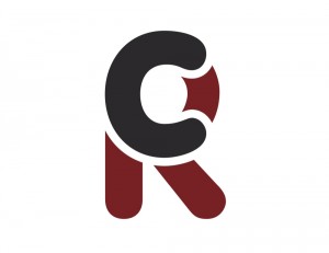
 First take on the iconified version of the logo. Complaints of the angular nature of Helvetica Bold against the curve of the cloud. I actually really like the tension at the upper right of the “R”.
 Revision of the iconified version of the logo.
The following are the rest of the logos that were created in the first round and rejected for various reasons. I still like the playfulness of the “CR” series. I’ll likely use it for something else in the future.



Leave a Reply
You must be logged in to post a comment.