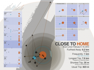
Our assignment last week was to use Foursquare to log our daily travels. This week, we were asked to use a classmate’s Foursquare check-in history as the source of our visualizations. I was given Bryan Lence’s data and set off to see what was there.
Over the past few weeks I’ve been teaching myself the R “environment for statistical computing and graphics“. It’s an open source project and has a doubly steep learning curve (for me, at least) of an unfamiliar syntax and medium (statistics). I can see it’s power for visualizations, however, when used to reveal interesting associations which can be further refined in other graphics software (in this case, Illustrator).
We began by looking at KML feeds of check-in history as provided by Foursquare in Google Earth. This quickly gave us a rough idea of what the check-ins looked like geographically. I put together a simple python script which parses the KML into an easy-to-ingest CSV file. I analyzed this data in R for several days, mostly learning how to get around in the language and getting up to speed on the ggplot2 package, following the advice of Mike Driscoll as he described during his presentation to our class last week. After simply plotting the check-ins, I still had to ponder the story behind Bryan’s history. Aside from learning R syntax, teasing out a meaningful story was the most difficult part of this project.
In the end, I noticed that Bryan spent almost all of the week approximately within 1 kilometer of his home. With that in mind I started to work out the lengths of trips (distance between check-ins) and the distance to each from his home. Breaking out the travels by day revealed some neat relationships in the pattern. I also looked to see if weather conditions contributed at all, and while this data set is quite small (42 check-ins over eight days), there were three days of snow with light travel (which, admittedly, could be coincidental).
I took several plots generated by R into Illustrator for refinement and layout. I’m happy with this result, acknowledging that it’s a pretty rudimentary start to data visualization using these methods.

Leave a Reply
You must be logged in to post a comment.