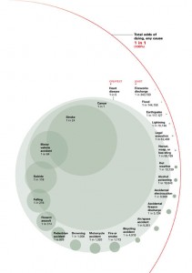
Here’s a really interesting infographic. I can’t recall the source, but if someone points me to it I’ll credit them appropriately. I really appreciate how probability is immediately comparable via the relative sizes of the ellipses.
Update: Apparently it was published in the National Geographic in August 2006 based on data from the National Safety Council (http://www.nsc.org/research/odds.aspx). Thanks for the comment!

Leave a Reply
You must be logged in to post a comment.