(Here is the documentation for my thesis project at NYU’s Interactive Telecommunications Program. PDF version here.)
Riding through Mountains of Data:
Visualizations of Cycling
Robert Carlsen
Interactive Telecommunications Program
Tisch School of the Arts
New York University
Abstract
This project attempts to describe the cycling experiences of several riders in New York City through a series of visualizations. Specifically, I am interested to discover if riders similar to myself share a common experience through which a sense of connection could be derived.
Cyclists were encouraged to record their travels using their personal mobile devices running Mobile Logger, a custom iPhone application.
Log data was uploaded by the application to an online database in near real-time during each ride. This data was analyzed and filtered to provide source material for the resulting visualizations and system “dashboard” at http://mobilelogger.robertcarlsen.net.
Keywords
Cycling, New York City, sensors, iPhone, visualization, mapping, tracking, logging, mobile, application, bicycle
Introduction
This is an exploration in creating a sense of connection among cyclists through self-quantification and visualization. The project has two principle components: data collection using personal mobile devices and visualization.
I ride a bicycle daily through NYC, and encounter many other cyclists, walkers and drivers. We pass each other in a moment, or perhaps share a lane for a bit and then continue on our separate ways. Can we create a sense of connection by sharing our experiences? How does my 5 mile, 25 minute ride from Greenpoint to the East Village compare to someone riding from Queens? What does a ride around Prospect Park share with one in Central Park? What’s the loudest part of the city for a cyclist? Which routes are ridden most frequently and at what time of day?
What do these experiences look like? How could they be recorded? What could we learn about ourselves and our world if there was a ubiquitous network of sensors collecting data about the environment as we experience it? Would analysis and visualization reveal trends and patterns in the aggregate behavior of participants in the network?
Personal Statement
I’m an avid cyclist. I ride as a commuter, enthusiast and occasional racer.
I can get just about anywhere in the city, whenever I want and under my own power. It also provides fitness and for many people, employment. It’s faster than walking and more maneuverable than driving. In dense city congestion it can be faster than mass transit. It’s a cheap way to get around. But above all… it’s just FUN!
Cycling in the city-and what I really mean by that is riding among several-ton moving vehicles, in all sorts of weather, often on roads not designed to accommodate bikes-is by some estimation, insane. I could describe close calls, spin tales of getting from Midtown to the East Village in less than 10 minutes at 6pm on a weekday or talk about an epic ride past Nyack where I bonked on the return trip-but there’s something really interesting about quantifying our experiences; somehow they become more tangible.
I first felt the excitement of self-quantification when using a heart rate monitor for training, and later when using a PowerTap cyclecomputer which could download ride logs to my computer. Having numbers for heart rate, speed and power provided nearly endless bragging rights (and sometimes shame) among my cycling teammates. It was a way for us to connect our individual experiences in a manner that we could understand and compare.
I’m certainly not the only cyclist on the roads. I see scores of other commuters as well as couriers, delivery riders and pedicabs-from folks leisurely riding around the Park to kitted racers in a pace line. However, apart from a friendly head nod, or occasional exchange of choice words I generally feel isolated as I head from here to there; in the margins of the roads (or sometimes splitting lanes), over the bridges with their scenic views of the city skyline, in the frenetic bustle of 5th Ave. Midtown at rush hour and the desolation and darkness of post-midnight industrial Greenpoint and Queens.
I wonder, what do these other people experience while riding through the city? I have a clear understanding of what it feels like to me to be a cyclist in New York City. Is that experience a common one among other riders? How could I foster a sense of connection by relating through this shared experience?
There are several ways of describing an experience. We can say that we’ve ridden some number of miles in a day, or show the raw data numbers. Visualizations are a manifestation of real events with which I’m hoping to make an emotional connection between the riders and the viewer.
Background
This project really began in my first courses at ITP, resulting in a project which I called CycleSense and the subsequent visualizations created from it’s data. CycleSense attempted to provide me with a direct perception of the unseen space behind my bike while riding through traffic, with a goal of increasing spatial awareness through haptic feedback. A set of sonar range finders measured bilateral, rearward distance between my bike and traffic, driving helmet-mounted vibration motors with increasing intensity as the open space diminished.

Figure 1: CycleSense: Proxemic visualization
However, the range needed to positively inform action at the speed of cycling in traffic is better suited for visual and aural sensing, rather than the ultrasonic sensors which had a maximum range limited to about 25 feet. While the real-time feedback goal was not entirely achieved, visualizations of the data provided me with insight into how space is maintained by traffic and myself as a vehicle in the streets (it’s alarmingly tight at times).
The visualization mapped the range values onto Edward T. Hall’s Proxemic[] distance categories of Intimate, Personal, Social and Public to provide context (fig 1). Ten inches of space between myself and a multi-ton vehicle at 20 MPH can be described as intimate proximity in this system. Imagine being within an intimate space with someone, then imagine them as a large truck barreling past you and you can get the idea.
I continued to explore this topic with seismi{c}ycling, which mapped bumpiness I experienced while cycling through New York City over several months. Where CycleSense used custom hardware mounted to the bicycle, I was interested in using a personal mobile device, an iPhone which I already carried, to act as a sensor in this project. By using my mobile phone with custom software, I was able to record more than 90 rides over the duration of the project. It became very easy to record consistently when I already had the sensor and data logger in my pocket. Using the network connection provided by the phone, I was able to push the readings to a database in real-time, streamlining data collection even further.
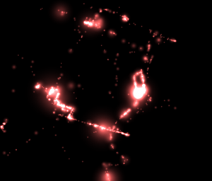
The visualization created for seism{c}ycling was an animated map, tracing each ride in turn, depicting the biggest bumps as glowing red circles. The entire visualization would scatter apart with each new bump, providing a sense of being physically rattled by rough roads. Eventually these spots accumulated to paint a portrait of my experience of the roads in NYC as a cyclist. While the end result was very satisfying for me, it was still centered on my singular experience. I wondered, what about other riders? Do we share a common experience? If so, in what ways? How are our experiences unique? I knew that the project needed to be expanded to include other people.
Work Description
Overall, the work involved with this project followed the seven steps for data visualization as outlined by Ben Fry in his book “Visualizing Data”[]:
- Acquire
Obtain the data, whether from a file on a disk or a source over a network. - Parse
Provide some structure for the data’s meaning, and order it into categories. - Filter
Remove all but the data of interest. - Mine
Apply methods from statistics or data mining as a way to discern patterns or place the data in mathematical context. - Represent
Choose a basic visual model, such as a bar graph, list, or tree. - Refine
Improve the basic representation to make it clearer and more visually engaging. - Interact
Add methods for manipulating the data or controlling what features are visible.
A significant challenge in this project was implementing data acquisition. Existing studies of cycling has largely relied on cyclist survey[], case-study interview[], or logging cycling at a series of fixed locations. New York City Department of City Planning publishes an annual cycling map, depicting existing and planned bicycle route and greenways
(fig 2). Their methodology in generating the map is described on the department’s website:
The existing and planned routes are the result of extensive fieldwork involving analysis of traffic conditions and assessment of the connectivity, accessibility, and safety of the network, as well as meetings that sought community input.
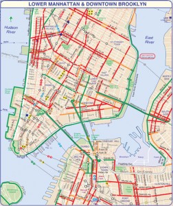
Figure 2: Lower Manhattan bicycle routes. Taken from the 2010 NYC Cycling Map.
However, I am interested in studying and comparing my personal experience with that of other cyclists, something which is only indirectly represented by survey and only inferred by fixed, external observation.
The data collection portion of this project utilizes a mobile logging application to record each rider’s experience. The application uploads data to a server for storage and later analysis. Each rider may view their own data within the application and can see an aggregate view of all the data on the Mobile Logger
website.
I was inspired by the Personal Environmental Impact Report (PEIR) created by the Urban Sensing group at UCLA, as described by Nathan Yau, a developer of PEIR, in the book “Beautiful Data”[]. That project also uses a mobile application, but logs position at a far longer interval. It determines the mode of transportation and estimates a user’s “impact on and exposure to the environment.”
Post collection, I analyzed the data looking for relationships and trends among riders and locations. This analysis is critical for the eventual visualizations. I have an initial set of questions which I’m looking to answer: Do several riders experience similar conditions at the same place and time? Where do riders go? Where do they originate? Where do they congregate? More personally, how do other riders’ experiences relate to my own?
Initial analysis was implemented using Google Maps to plot each ride. It was a useful tool to identify the location of new events and to verify the integrity of recorded data. Through this tool several issues with location accuracy and network connectivity were identified.
Further exploration of the ride data was done using R, the language and environment for statistical computing and graphics. Several aspects of ride data were investigated, starting with simple plots of event routes then later graphs of the frequency of ride times and locations. R was also used to filter and clean the raw data.
Several graphs and plots generated in R (using the excellent ggplot2 library) were further manipulated in graphics software to create initial, static visualizations, including a world map of Mobile Logger users. Graphs of ride distribution by time of day, day of week and location also helped to categorize data.
Ultimately, an animated visualization of ride data in New York was created using Cinder, an open-source C++ framework. This visualization depicts events in a 3D environment primarily by location and time, showing similar inferred experiences swirling about each other.
Before any of this, however, data needed to be collected and tools to achieve this needed to be audited and created.
Ubiquitous Sensing
Sensors are increasingly being embedded in everyday devices and infrastructure. Many modern laptop computers include a “sudden motion sensor” designed to save the hard drive in the case of a fall. Buildings can include climate and movement sensors-which can be used to coordinate dampers to help stabilize the building in high winds or an earthquake. Small wearables like the FitBit or
DirectLife track activities like walking and running as well as restlessness during sleep. Portable devices, like the iPhone include a small array of sensors, which can record movement and orientation, sound levels, location, photos and video. Fleets of cars and trucks include GPS devices not only for navigation but for tracking the vehicle’s location and speed.
However, the real impact of these sensors becomes realized when imagining them networked. Adam Greenfield describes powerful scenarios resulting from “ubiquitous urban sensor networks.” He envisions advancement in sensor technology providing for a pervasiveness in which urban infrastructure, such as road surfaces, sidewalks and buildings are addressable, queryable and therefore scriptable, providing a programmatic interface to the modern city.
What if each computer with a sudden motion sensor could report anomalies in real-time? Could this serve as an earthquake early warning system, as Quake Catchers is trying to implement? Using GPS-enabled mobile devices, services like Waze provide navigation directions in exchange for users passively providing traffic conditions, which then informs the service’s direction algorithm. SenseNetworks has released the CabSense application using the NYC Taxi GPS database and the GPS feature of iPhone and Android devices to point users to the best places to catch a cab.
Going mobile
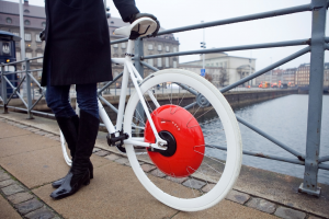
Figure 3: MIT’s Copenhagen Wheel
Two broad categories of sensors are fixed and mobile. Fixed sensors have the benefit of being able to directly connect to existing power and communications infrastructure. They can be installed at an appropriate density and dispersion for the environment and what they are designed to monitor. For example, air quality sensors in a sparsely populated area may have different requirements than sound sensors in a city. They can remain logging when no one is present. They can be installed in inaccessible or uninhabitable locations which nevertheless would be useful to monitor-subway tracks, pipelines, transit vehicles, etc.
However, when trying to describe how people move through an environment, the best they can do is to infer these experiences from afar. Mobile sensors, specifically those embedded in mobile devices, prioritize sensing a personal experience. Of course, even these sensors are limited to their specific capacity-such as movement, location, or orientation-but have the great advantage of being representative of an individual in that environment.
Mobile data collection presents significant difficulties. Aside from persistent challenges of securing reliable power and communication, these sensors have to be deployed to people willing to carry them. In the case of the FitBit a user needs to acquire and use a new piece of hardware. The same challenge faces Nike+ devices and initiatives like Copenhagen Wheel, a project by the MIT Senseable City Lab (fig 3), a veritable environmental lab built into the hub of a
rear bicycle wheel.
Using personal mobile devices as sensors in this ubiquitous network, the aforementioned challenges notwithstanding, provides an advantage that they are already carried by owners and are already used daily. The threshold for encouraging greater participation drops sharply when you already have the necessary tool in your pocket. This assumes that capable devices are widespread-GPS-enabled mobile devices are becoming prevalent enough to use them for large-scale personal data
collection. Nielsen reports that (sensor-laden) smartphones make up 27% of the wireless market in the US, and are expected to reach 50% by the end of 2011.
Mobile application
This becomes a trade-off between depth and breadth. Adhoc, mobile sensor widgets can be designed to record rich data beyond what is available in existing mobile devices-like air quality, heart rate, stress and breathing-but each device starts with zero units in the world. Apple introduced over 20 million GPS-enabled iPhone devices in 2009-quite a head start for my project. If useful data about individual experiences and relationships could be told using the relatively limited sensors available on existing mobile devices, what would that look like?
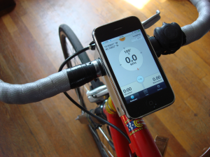
Figure 4: Mobile Logger on my bicycle
To that end, I released an iPhone application, named Mobile Logger, to facilitate this user-centric data collection. It’s available as a free download on the Apple App Store and as open-source code on GitHub under the GNU Public License. The application was written in JavaScript using the open-source Titanium Appcelerator framework, which is designed for cross-platform distribution to iPhone and Android platforms, as well as upcoming support for BlackBerry. This choice was made to allow for flexibility in the future porting of the application to a wider selection of devices.
Mobile Logger acts as a dashboard for someone interested in recording their movement. The home screen presents a compass-like heading display, along with current speed, sound levels, acceleration force, trip distance and duration. Each log is stored on the device and can be inspected to reveal its route on a map. The log file can be exported via e-mail in several common formats. While logging, the data is optionally pushed to an online database at frequent intervals.
To date, 164 unique devices have uploaded log data globally representing 239 events longer than 1 minute, with approximately 10 active riders in NYC. Most of these new devices appeared after public release of the application in the Apple App Store. In addition to the ambient logging, I promoted a call for participation to coincide with Earth Day on Thursday, April 22nd with the intention of benefiting from a tendency for people to ride a bicycle on that day.
The application has been used in every continent, save Antarctica. To illustrate the global reach of deploying the application on an already established platform, the Mobile Logger Dashboard at http://mobilelogger.robertcarlsen.net displays a map of every location where the application has been used for longer than one minute, as well as tallies of unique devices, events, duration and distance.
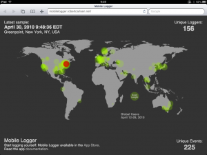
Figure 5: Global users of Mobile Logger
Collection
To facilitate collection of log data from participants I setup an online database and rudimentary application programming interface (API) for the mobile devices to utilize. The database used is Apache CouchDB, a document-oriented, schema-less database which can easily be interfaced via a “RESTful JSON API that can be accessed from any environment that allows HTTP requests”. CouchDB was chosen for several reasons, among them:
- Most mobile devices that can access the internet support HTTP requests, eliminating the need for specific software libraries to communicate with the database.
- Without a strict schema, devices with various sensor capabilities can be easily included in the database, simply adding new fields as necessary.
- CouchDB includes facilities for easy replication, or cloning, of the database. This can be used to archive the live database, to make a copy which can then be queried for exploration without affecting real-time upload from mobile devices, for scalability as demand may increase requiring more server capacity and eventually for sharing the data with other interested researchers.
- Queries can be constructed in JavaScript using the MapReduce paradigm to provide powerful ways to aggregate the collected data.
- CouchDB can scale to hundreds of millions of documents. Each sample in a log file is treated as a separate document and a typical 24 minute log file may contain 1600 samples.
To provide a simplified interface for mobile devices and to provide a layer of abstraction between the database itself and open internet a middleware layer was created using Sinatra, a lightweight, Ruby-based microframework. Sinatra made it easy to expose only the needed methods for adding and retrieving log data from the database. This provides security by limiting the database access only to the API methods via the middleware, enables flexibility in changing the location or name of the actual database and allows for future scalability through sharding, or splitting the database among several servers to distribute the load.
The middleware layer also provides access to the data for the Mobile Logger Dashboard site, and may be used in a future version of the Mobile Logger application for real-time feedback about the overall state of the system. Eventually, this API may enable third-parties to access log data for their own analysis and visualization.
Dirty Data
The raw data collected from participants can be very messy. GPS often misreports location amongst interfering objects such as tall buildings in cities. Also, this project is interested in the travels of cyclists in New York City, but there is no physical limitation preventing users from logging any type of movement (or no movement at all) anywhere in the world. The data needed to be filtered, cleaned and sorted before meaningful analysis could begin. Filtering specific locations was achieved by geohashing the location data. Geohashing creates a unique string of letters and numbers for latitude and longitude pairs, which represents a decreasing rectangular area by increasing hash length. A hash of 6 characters such as “dr5rsn” represents a 600 meter wide area of Lower Manhattan (fig 6). The database can be queried for specific hashes to get data associated with particular locations.
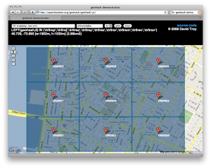
Figure 6: NYU geohash. Displayed with David Troy’s geohash demonstrator.
Filtering events by mode of travel is another challenge. A simple solution is to factor the events by average speed, assuming that bicycles typically travel faster than walking, but slower than driving. However, I can often get around the city faster than a car, depending on congestion and time of day. Maximum speed can provide more insight, although a car may go slower in an intra-city trip than I ride descending one of the bridges. Investigating the route may also help, assuming that a bicycle is not likely to travel on highways, and vehicles not on bikeways. Unfortunately, in both regards, this is a false assumption in the city. Ultimately, some naive filtering with manual analysis was necessary to isolate cycling events from the rest of the data. The greater challenge is to identify trends and categories in the remaining ride data.
Bias
In considering the collected data it becomes apparent that there are specific biases which should be addressed in order to make an honest assessment about anything derived from it. The project considers cycling as the primary activity, and as such other modes of transportation have been eliminated from consideration in the data. While using a mobile device did tap into a large pool of existing users, the iPhone is still a limiter of possible participants. Rather than targeting all cyclists in New York, this requires participants to be a cyclist (in New York City) and be an iPhone owner. While a targeted study may identify what portions of these populations actually overlap, anecdotally it seems that there is certainly a demographic bias.
From a technological standpoint, Mobile Logger places significant drain on the device’s battery. Users have reported that the maximum logging duration on a full charge has been about 2 hours. In my personal use, a typical 25 minute commute consumes 15-20% of the battery charge (on an iPhone 3GS). I could get through a day with two logging sessions and light use (e-mail, web, infrequent voice calling) on a single charge. However, I often would recharge the phone over the course of the day.
These considerations seem to have made the application most suitable for logging trips less than 30 minutes in length, where the device could be used solely for data collection and have limited use otherwise or be recharged during the day.
The application and use case have been designed for riders like myself. Given this project’s focus in wanting to see what riders like myself are experiencing I don’t feel that this is a deleterious bias, but something certainly to be aware of when considering the data.
Finally, I need to mention that data from my device is by far the most prevalent in the Manhattan area, representing 55% of the recorded samples.
Analysis
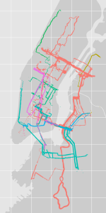
Figure 7: New York City ride data. Colored by device.
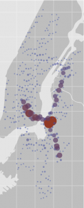
Described earlier, geohashing provides a mechanism to isolate specific locations in the database. The adjacent hashes of “dr5r” and “dr72” encompass most of Manhattan and Brooklyn, were ride data is concentrated. Querying the database for these locations returns approximately 160,000 samples, roughly 3,000 minutes of log data (fig 7). A typical event contains 1,600 samples at 1Hz resolution.
In Manhattan, the raw data indicates 150 events were recorded by 17 devices. Simple filtering of events where the maximum speed was less than 60km/h (generally faster than a bicycle travels on flat ground) reveals that my device was the only one used in the Manhattan data set to record a trip by car. Further filtering of devices which recorded less than two minutes of data leaves 10 devices. I believe that three of these device IDs represent testing or simulator devices.
Rides most often occurred at typical morning and evening commute times, with greatest density of samples in the 8-9AM and the 6-7PM hours (fig 8). There is also a significant dispersion of my ride files throughout the evening, reflecting riding home from ITP at late hours.
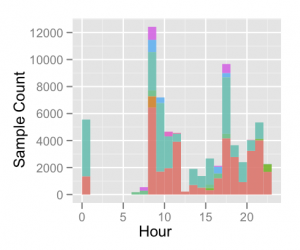
Figure 8: Log samples by hour. Colored by device.
Ride activity trends upwards on a daily basis with a peak on Fridays (fig 9). Low activity on weekends seems to confirm that the data reflects commuting rides. The pattern is interesting, but it’s difficult to extrapolate whether this is indicative of anything other than the weekly schedules of this small group of riders.
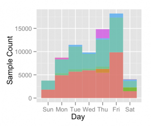
Figure 9: Log samples by day of week. Colored by device.
Three events have unusually long durations (more than 10 hours), appearing to have been accidentally resumed for a few moments long after the intended logging period ended. Filtering these events as well as those with durations of less than 1 minute leaves 123 events with an average duration of 24 minutes. One event has several breaks of 20-30 minutes, with an overall duration of 160 minutes. I spoke with the rider about this and he mentioned that he considered a trip, including stopping at various locations for errands, as one event. I
had previously considered each segment of a trip as separate events, so his was an illuminating perspective which needs to be considered.
Ride data was concentrated in Lower Manhattan and Brooklyn, again likely due to the stated sampling bias (fig 10).
The densest location is the Brooklyn entrance to the Willamsburg Bridge. The bridge path and routes to ITP’s East Village location are the most frequently represented, as well as a route through Queens to the 59th Street Bridge, likely from my own commute to Midtown.
Regarding GPS performance, the mean accuracy for this data is 60 meters, with a best reported accuracy of 9 meters. Mean altitude is 18 meters (with 13 and 23 meters at lower and upper 25th percentiles), however the mean altitude accuracy is 62 meters, so I suspect that the altitude data is not entirely reliable (although these values do seem consistent with external altitude data available via the NYC Data Mine
site).
An assumption I’ve made is that Mobile Logger would be used for ground-based travel. However, New York has many tall buildings and bridges. Indeed, there are several altitude readings in the 40 meter range, the approximate height of the Manhattan, Willamsburg and Queensboro bridges which I frequent. There are also small groupings of samples with recorded altitudes at 200 and 500 meters which have an accuracy of 228 meters and have been filtered.
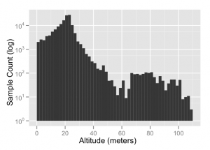
Figure 11: Manhattan altitude readings, filtered.
The average moving speed of rides, filtering zeroes, for the entire data set was 18.5 km/h with a standard deviation of 7.6 km/h (fig 12). My average speed was fastest (of this small set) at 20.6 km/h, but I have company with other riders at 20.1 km/h and 18.5 km/h.
There are two devices with markedly slow average speeds. It’s difficult to tell if these devices were used for walking, very casual riding, or suffered from poor GPS reception. The speed accuracy of the device seems to improve at greater velocities, such as driving and cycling quickly. Walking, even briskly, often reports zero speed.
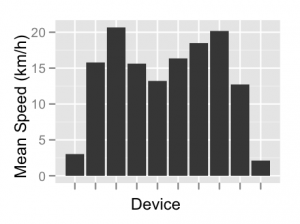
Figure 12: Average speed by device
Average distance for the rides was 8km with a standard deviation of almost 5km, including several rides over 20km and one at 32km. My typical ride length was 8.7km and it appears like there is another rider who rides a similar distance frequently (fig 13). A by-product of GPS inaccuracy is incorrect distance estimates when plotting between raw coordinates. If several location readings are off by a large amount, distance can quickly, and erroneously accumulate. One promising technique for
filtering raw GPS data is outlined by Julien Cayzac, titled “The Cumulative Displacement Filter.” I’m eager to apply this technique to the ride data in future development.
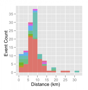
Figure 13: Event distances. Colored by device.
Audio levels were recorded using a digital scale (-60 to 0 dbFS) and it is difficult to convert these values into a generally comparable unit (dbSPL) without proper microphone calibration. Nevertheless, relative assessment can be made using these values. The mean sound level recorded was -23 dbFS, with a standard deviation of 8.2 dbFS. However, little is known about circumstances of the device while recording, specifically it’s location on the participant. It could have been in a variety
of places which may affect detected sound levels, such as in a pocket, backpack or attached to the bicycle itself.
The accelerometer values can indicate two aspects of the device’s experience: orientation and movement. Since the application is recording at a one second resolution, subtle device movement is lost in subsequent downsampling. However, overall device orientation can be inferred by analyzing a distribution of the available values (fig 14).
Peak densities for X,Y and Z-axis accelerometer forces indicate that the (iPhone) device was primarily upright, tilted right and somewhat face down. I keep the device in the same location and position for each log, in a pocket on the shoulder strap of my backpack, which keeps it upright and angled to it’s right. I always put the device in the pocket facing forward, but when I’m in a riding position my chest is pointing downward as I reach for the
handlebars. Since my logs account for 55% of the data, it’s unsurprising that my consistent position is apparent.

Figure 14: Overall accelerometer forces
The magnitude is a vector created from all three axes, and should have a value of 1.0 when the device is stationary, regardless of orientation. The distribution of magnitude values should indicate what degree of movement has been experienced. There is a noticeable spike at 3g, which is the upper specification of the sensor on the device and may indicate significant jostling.
Weather
During 34-day window in which this data was collected (March 29-May 2), the daily average temperature ranged from 46-77 F with a mean of 59 F, minimum of 40 F and maximum of 92 F. It seems as though most of the riding occurred in mild temperatures. Rain was recorded for 10 days of this period, accumulating 7 inches of water.
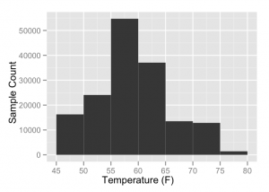
Figure 15: Sample count by daily average temperature.
Wind speeds over this time averaged 10 km/h, including at least three days with appreciable gusts.
This wind may have had an effect on ride speed, although it’s difficult to determine solely through the data. Personally, I recall several days where my trips were buffeted by wind on the bridges.
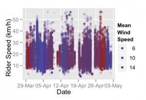
Figure 16: Rider speed colored by wind speed
Visualization
While statistical analysis and numerical representation are indispensable in identifying categories and trends while mining the data set, eliciting an emotional response from a table is a difficult proposition for me.
In cycling training software numeric summary tables, graphs and plots are often used to display the logged ride data.
The graphs honestly depict the data, but how do these visuals really convey the recorded experience? Various plots which have become common in cycling training analysis certainly do provide some insight into the numbers, at the expense of having to learn to decipher them.
Golden Cheetah, an open-source cycling analysis application, implements several of these typical displays.
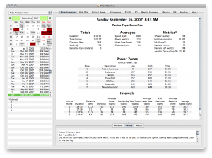
This application does indeed represent ride data in tabular format, identifying average, maximal values and aggregate values (fig 17). It also displays the data in a time-based graph, overlaying several metrics along a vertical axis. One particular plot, popularized by Dr. Andy Coggan, is the Pedal Force / Pedal Velocity scatterplot (fig 18). This plot is highly revealing of the types of physiological exertion demanded of a rider during an effort.
However, to a wider audience it is highly opaque. How could these visualizations be done in a way that is immediately apparent and meaningful to an uninitiated viewer?
My goal is not to single Golden Cheetah out, but to use it as representative of cycling analysis software (full disclosure: I have been a developer with the project for several years).
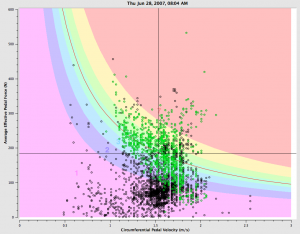
Figure 18: Pedal Force / Pedal Velocity plot for an individual time trial effort
There are great examples of visualizations which communicate their data concisely and are visually striking enough to resonate emotionally with viewers. Aaron Koblin’s Flight Patterns (fig 19) show the daily patterns of air traffic across the United States.
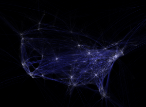
Figure 19: Flight Patterns by Aaron Koblin
Cabspotting (fig 20) by Stamen Design also tracks taxis, displaying their routes over time in San Francisco.

Figure 20: Cabspotting by Stamen Design
My own project, seismi{c}ycling (fig 21) painted a portrait of road roughness I experienced over several months in the Fall of 2009.
What does it look like?
The visualizations in this project consist of three broad components: the in-application map, the website “dashboard” and the animated off-line visualization.
Within Mobile Logger, each log stored on the device can be displayed on a map, with a subset of the data points plotted to depict that log’s route (fig 22). Each data point can be tapped to display the speed and sound levels at that moment. This was implemented to provide value to the end user, beyond and apart from the centralized data collection component I am most interested in. I wanted the application to be able to stand alone, without the online database if necessary, or if
the user preferred to opt out of sharing their data.
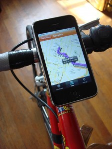
Figure 22: Mobile Logger map view
On the Mobile Logger Dashboard website there is a map displaying the location and duration of global use of the application and an animated marker indicating the location of the most recently logged event. This has created an immediate and profound effect in generating a sense of connection for me. I find myself frequently checking the map to look for new locations representing other people logging around the world. While this is a departure from the intended study of New York City
cyclists, the excitement of acknowledging global use warrants mention.
An animated visualization was created to display the ride data in a fluid, aesthetic way. This visualization plots rides in various ways in an attempt to show now only the characteristics of each ride, but also of how they relate to one another. It was designed to be standalone and installed in a semi-public location.
Personal data
I’ve considered the issue of personal data privacy heavily. Each of these logs contains one-second resolution of the location of individual participants. Although the application doesn’t record personally identifiable contact information, each log (unless disabled) contains a unique identifier for the device. Over time a pattern of movements could become unique enough to isolate an individual. In an era when personal information is increasingly volunteered and/or unknowingly collected, is location privacy a specific concern?
Is the solution to balance the power between the participant and users of that data through transparency? Rather, are the stated principles of Sense Networks sufficient?
- People should own their own data
- People have a right to privacy
- People should receive a meaningful benefit in exchange for sharing data
- Aggregate anonymous location data should be used for common good
In consideration of these points, I’ve made deliberate decisions regarding the data collected by this project. I’ve opted not to request personal contact information from any participant, and have additionally provided a means for participation with an anonymous device identifier. The data uploading feature of Mobile Logger may be disabled at any time, without any detriment to the usability of the application for the end user. By providing their data to the Mobile Logger system, they can
see their place among other users on the Mobile Logger Dashboard and associated visualizations. I’m also considering other ways for participants to more directly benefit from sharing, perhaps with personalized data display on the Dashboard site, or real-time status of the system within the device application.
If the system were to fully embrace the Sense Networks principles, a method would need to be implemented for any user to remove their historical data from the database as desired.
This is my primary hesitation in opening the data set to third parties, although I’m interested in eventually making the data available to facilitate the final principle of working for the common good.
Where do we go now?
The stated goal was to foster a sense of connection among strangers through sharing common experiences, using these visualizations as a way to make abstract numbers meaningful to uninitiated viewers.
While there have only been a few riders in New York logging themselves, I have certainly had a palpable shift in my perception of riding through the city. Perhaps it’s because I’ve been looking over my own ride data lately, but I often imagine what other riders’ log files would say and how ours would compare.
One Mobile Logger user who also lives in my neighborhood saw screenshots of my log routes and contacted me, mentioning that he lives nearby and offered to meet up.
I have progressively altered my routes in the months I have been tracking my rides. Generally, I strive for the most direct route, and the mapping feature of the mobile app enables me to immediately see if I can make improvements. However, I often prefer less-trafficked or quieter roads to busier ones, and will look for a bike lane if it’s convenient.
When I cross paths with another rider, I imagine a ribbon tracing our paths and extending into possible future routes. I also like to consider where they’ve been and think about how my ride could be influenced by their route.
I have also begun to strike up conversation with other riders, often describing Mobile Logger and encouraging their participation which is generally well-received.
In the end, however, there are still many riders and vehicles around and I still get cut off, have close calls and epic rides (and make some ill-advised maneuvers of my own).
The preliminary global data has had a profound effect on me. I noticed one day that while I was commuting home after work in Manhattan there was a training ride in Philadelphia, an evening drive in Bristol, UK and an early morning walk to the beach in southern Australia. This provides me a sense of connection to these far away strangers. Even in this abstract representation, I feel less alone knowing that other people are also moving about. Of course, technology isn’t needed
to prove this, but sometimes a construct helps to shift perspective.
I’m pursuing a greater density of data through encouragement of wider rider participation. Public, aggregate, real-time visualizations will help promote persistent participation if individual contributions can be recognized by the user.
I’d like to solicit more feedback from participants about their experiences. Perhaps providing a mechanism to tag or annotate ride data could assist with categorization.
I’m also very interested in extending the mobile application to record external sensors. I would very much like to log physiological data such as heart rate, breathing rate / depth and stress levels as well as environmental data. Perhaps this can be accomplished through various levels of commitment on the part of the rider to incorporated several devices for self-quantification. Ideally, the mobile device will act as a hub for storage and transmission.
I’ve published the project’s process in the spirit of open source. This includes releasing the logger application source code, documenting collection methods and describing the visualization process. Eventually, I aim to publish the collected data for further analysis. Hopefully, this will enable other people to extend and augment the work in ways I haven’t envisioned.
References
- Ben Fry.
Visualizing Data: Exploring and Explaining Data with the
Processing Environment.
O’Reilly Media, 2008. - E.T. Hall.
A system for the notation of proxemic behavior.
American anthropologist, 65(5):1003–1026, 1963. - Matthew Ides.
Hub and Spokes: Imageability of the Daily Bicycle Commute in New
York City, 2008. - Toby Segaran and Jeff Hammerbacher.
Beautiful Data: The Stories Behind Elegant Data Solutions.
O’Reilly Media, 2009. - Ph.D. William E. Moritz.
A SURVEY OF NORTH AMERICAN BICYCLE COMMUTERS, 1997.
Footnotes:
1http://www.nyc.gov/html/dcp/html/bike/cwbm.shtml
2http://mobilelogger.robertcarlsen.net
3http://www.r-project.org/
4http://had.co.nz/ggplot2/
5http://libcinder.org/
6http://news.wustl.edu/news/Pages/8961.aspx
7http://www.fitbit.com/
8http://www.directlife.philips.com/
9http://speedbird.wordpress.com/2009/10/11/toward-urban-systems-design/
10http://qcn.stanford.edu/
11http://www.waze.com/homepage/
12http://www.sensenetworks.com/macrosense.php
13http://cabsense.com/
14
senseable.mit.edu/copenhagenwheel/
Photos by Max Tomasinelli www.maxtomasinelli.com
15http://blog.nielsen.com/nielsenwire/consumer/smartphones-to-overtake-feature-phones-in-u-s-by-2011/
16http://www.apple.com/investor/
17http://robertcarlsen.net/dev/mobile-logger
18http://github.com/rcarlsen/Mobile-Logger
19http://www.appcelerator.com/
20http://couchdb.apache.org/
21http://www.sinatrarb.com/
22http://en.wikipedia.org/wiki/Geohash
23http://openlocation.org/geohash/geohash-js/
24http://www.nyc.gov/html/datamine
25http://julien.cayzac.name/code/gps/
26http://www.wunderground.com/history/
27http://goldencheetah.org/
28http://home.trainingpeaks.com/articles/cycling/quadrant-analysis.aspx
29http://www.aaronkoblin.com/work/flightpatterns/
30http://cabspotting.org/
31http://robertcarlsen.net/projects/seismicycling
32http://www.sensenetworks.com/principles.php
File translated from
TEX
by
TTH,
version 3.87.
On 11 May 2010, 23:00.
Leave a Reply
You must be logged in to post a comment.