Working with a large database of wines for the next Visualizing the Five Senses project. The database contains much information on approximately 5000 wines. After much thought on the sense of taste and after reading up on wine varieties, I decided to focus on the six categories of wine (Red, White, Sparkling-Red, Sparkling-White, Fortified-Red and Fortified-White), and several oft-repeated taste characteristics noted in the wine descriptions.
This is very much a work in progress. My ultimate goal with this visualization was to see if various varieties of wine share characteristics with other varieties of the same category.
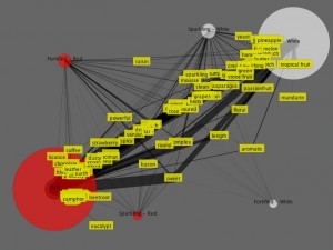
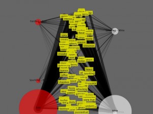
The categories and taste characteristics are depicted in a network graph, and suffer from congestion due to the number of visible items. I’d really like to refine the display to isolate specific characteristics and/or wine varieties to clarify the visualization.
The above image depicts an early state of the animation. The tastes begin in a centralized location and drift toward the various categories, eventually settling along an axis determined by the “strength” that a particular taste shares with the wine as inferred by the frequency of those taste terms found in the wine database taste notes.
Unfortunately, I’m unable to post the live applet at the moment as the database is in MySQL format and I have yet to publish the database online. Here is a video of the preliminary interaction. The movement of the category ellipses are from user interaction.


Leave a Reply
You must be logged in to post a comment.